Science Signs
Right now, some scientist, somewhere, is almost certainly toiling over a science poster by attempting to fit months' or perhaps even years' worth of research onto a single — albeit large — sheet of paper.
Eventually, they'll hang their creation on a temporary wall during some science conference's poster session, alongside countless others. And if the scientist is lucky, their poster will draw the attention of someone with the power to help them take their research to the next level, perhaps through a collaboration or funding opportunity.
Or maybe it'll inspire another scientist, who will then leave the conference motivated to begin a new line of research.
The problem is that these posters are stuck in the past — translation: they kinda suck — but a student in Michigan has a plan to change that.
Too Much Text
Mike Morrison is currently working toward his doctorate in psychology at Michigan State University. In a fascinating new NPR profile, he details what he thinks is wrong with the science posters currently on display at most poster sessions — and how a simple change in format could have a tremendous impact.
"Imagine you're driving down the highway, and you see billboards, but instead of an image and a catchy phrase, there's paragraphs of text all over the billboards," Morrison told NPR. "That's what we're seeing; we're walking through a room full of billboards with paragraphs of text all over them."
"It's mostly noise. You're just skimming desperately," he continued, "and you're going to miss a lot as you walk by."
Poster Overhaul
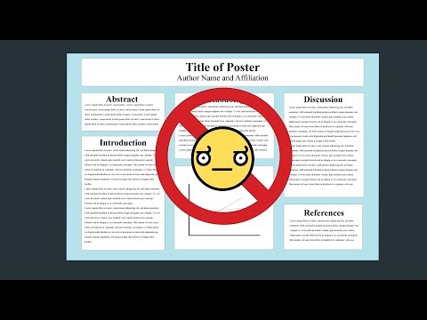
Fed up with the poster status quo, Morrison created and released a clever animated video in March — see above — detailing what he perceives as a better format for science posters designed to facilitate the seamless flow of information between all the smarties at these conferences.
In the clip, he suggests researchers replace the paragraph upon paragraph of tiny text with a clean design. It should feature their main finding in simple language written in big, bold letters with just a few key points taking up the remaining room on the poster.
Beneath that, the scientists can place a scannable QR code that directs people to a website featuring the details of the study.
READ MORE: To Save The Science Poster, Researchers Want To Kill It And Start Over [NPR]
More on science communication: Buzz Aldrin: Scientific Understanding Matters More Today Than Ever
Share This Article

